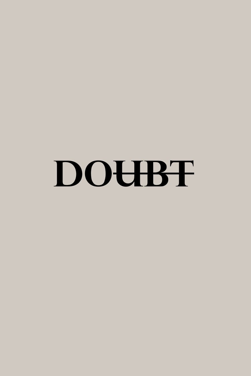
Text Decoration
This is the first blog post where I will have to keep my writing very minimal. I follow ten different media sources and there is a heavy lack of text decoration and transformation. Therefore I will highlight any decoration in little detail from as many sources as I can find.
Pokemon Go has text decoration in its name. The font is yellow and embossed to look three-dimensional and the name arches up to add what I perceive as depth.
The Stab logo is covered with a texture to make it look rugged, salted, and deteriorating. It has some holes in the typeface and it is fitting for the tropical/punk vibe of the magazine. Stab also uses fancy typefaces with decorations in its articles so I will count that as well, although it is up to the editor or producer of the content to include it.
Design Milk has a forward slash in their logo and it is fitting with the design of the typeface, as well as the graphic within the logo.
Tik Toks logo has a “3D” decoration to it where the blue and red drop shadows on the text imply that it should be popping out at you.
Most other media that I follow have no use of decoration on their typefaces. it seems cliche to say there is nothing to write about because what I have to write about is limited/doesn’t apply but for this particular prompt, there are only five pieces of decoration in the media.
This is the first blog post where I will have to keep my writing very minimal. I follow ten different media sources and there is a heavy lack of text decoration and transformation. Therefore I will highlight any decoration in little detail from as many sources as I can find.
Leave a comment